Perfect Properties Project
Finding your perfect property has just become a lot easier

Project Overview
The Project Scope
For this project, the brief contained information about the user research consisting of information about the primary persona, user stories and feature requirements.
The Problem
Buying properties is a safe investment and a way of achieving financial security, however, it can be hard to find the perfect property and reliable information.
The Solution
To create a responsive web app that provides property buyers with written and visual information on properties of interest. This will enable property buyers to make an informed decision.
My Role
UI Designer
Timeframe
February-March 2022
Tools
Figma, Pencil and paper
My Design Process
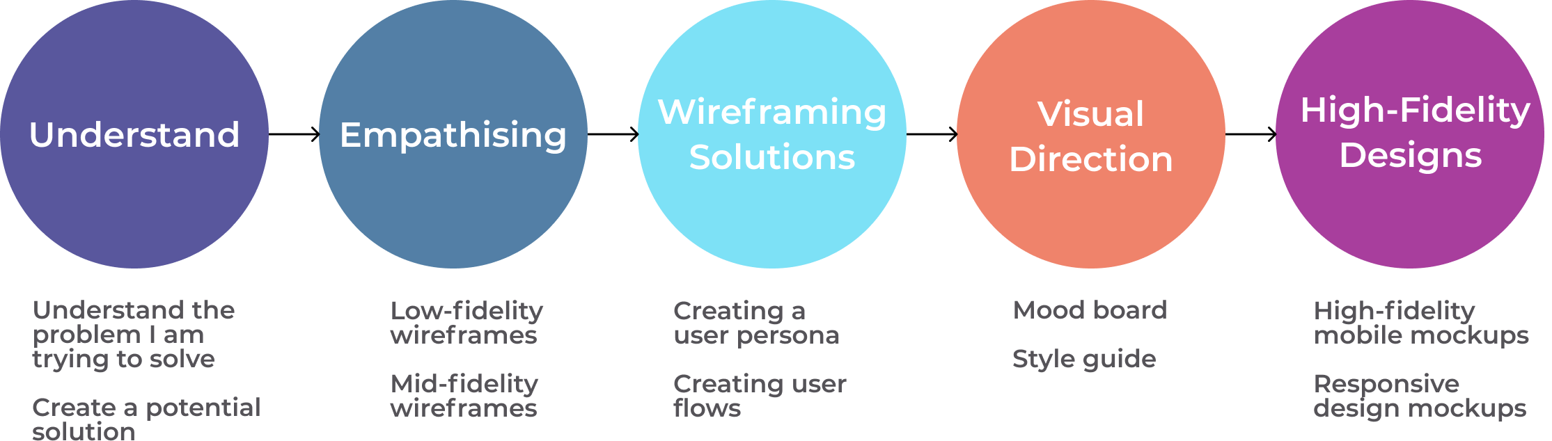
Empathising
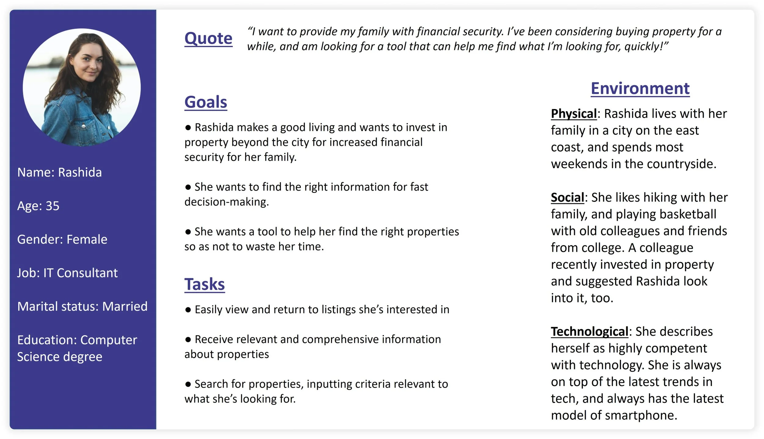
User Persona
I created a user persona based on the information provided in the brief to better understand the needs, motivations and pain points of our users. Doing this enabled me to empathise better with our users.
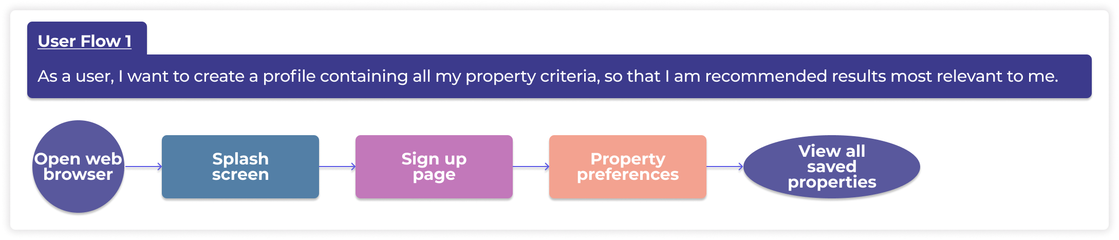
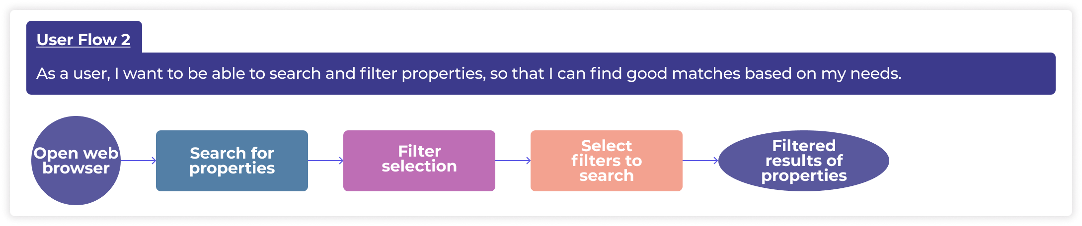
User Flows
Based on the information in the brief, I mapped out a series of user flows to understand and visualise what steps the user will need to take to reach their goals.

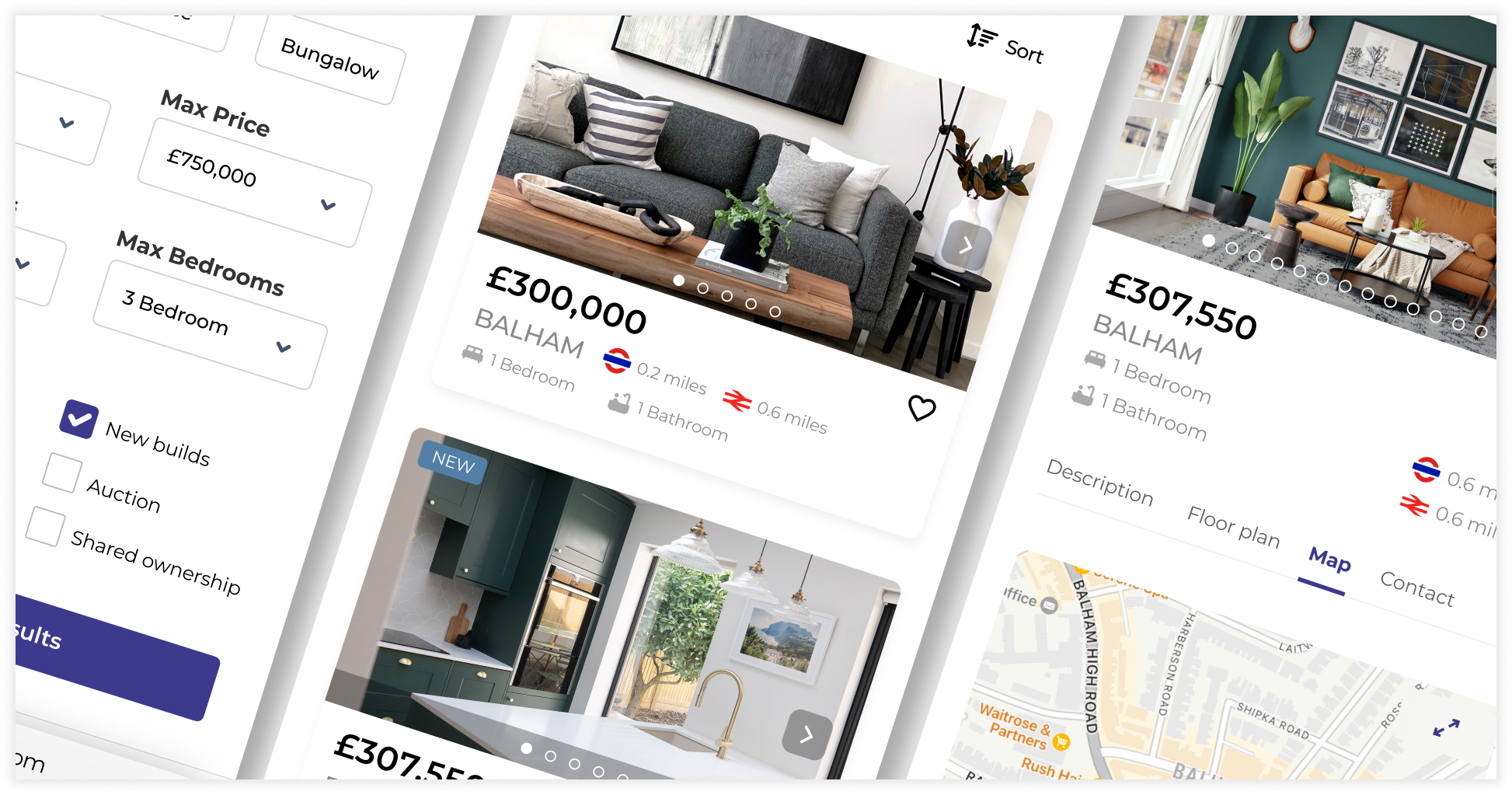
Wireframing Solutions
Low-Fidelity
The next stage was to create some low fidelity wireframes to structure how the app functions and meet the needs of the users.

User Flow 1
See the rest of my low-fidelity wireframes click below.
Mid-Fidelity
Next, I created some greyscale mid-fidelity wireframes using Figma. I added some UI elements to better convey the functionality of the app.
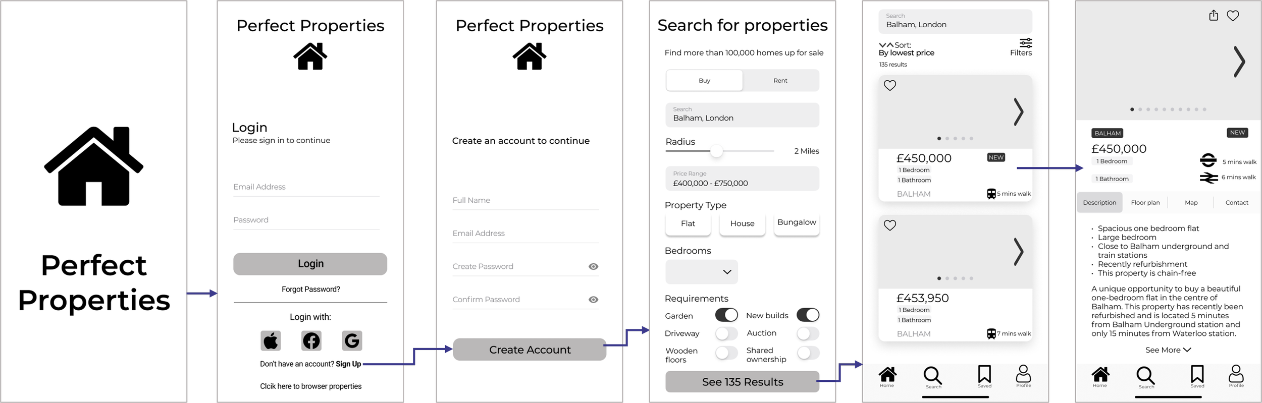
User Flow 1
See the rest of my mid-fidelity wireframes click here.
Visual Direction
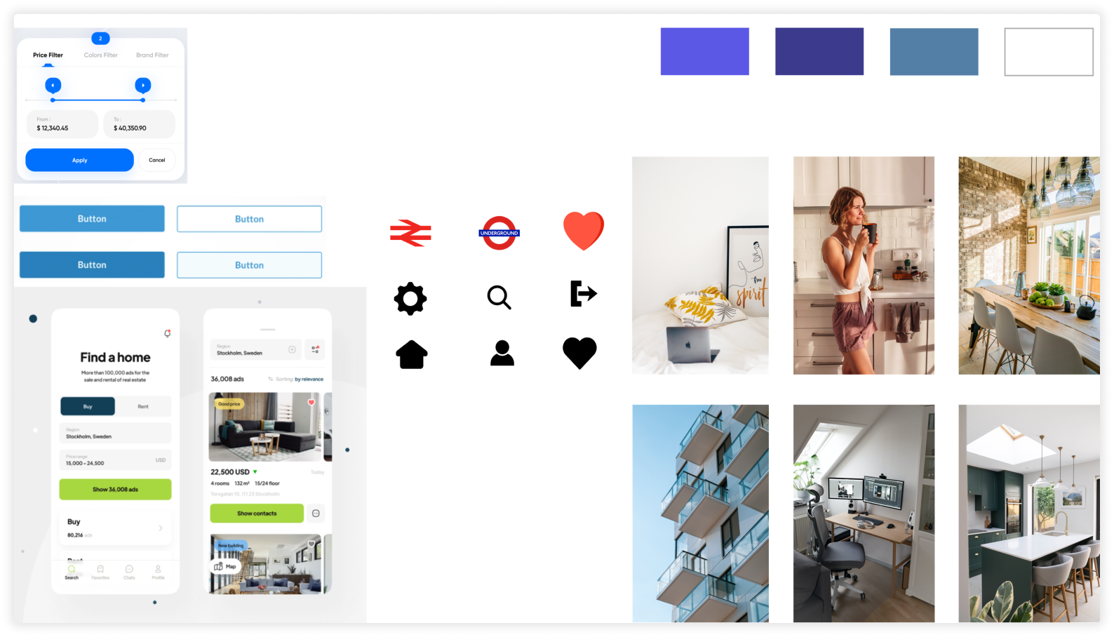
Mood Board
I created two boards to get some ideas, set the tone and determine the visual direction of the app. Below is the selected mood board for this project.
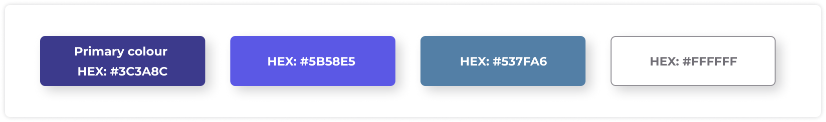
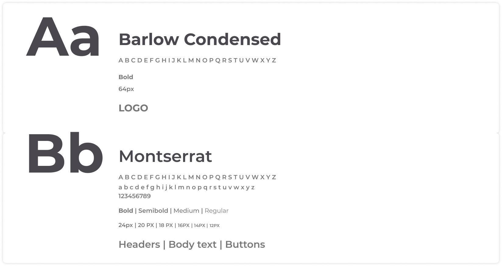
Style Guide
Now I had chosen a mood board and finished the mid-fidelity wireframes I moved on to the next stage. This involved creating a style guide containing a colour palette, typography UI components and elements used in my final mockups.
Colour Palette
Typography
Iconography

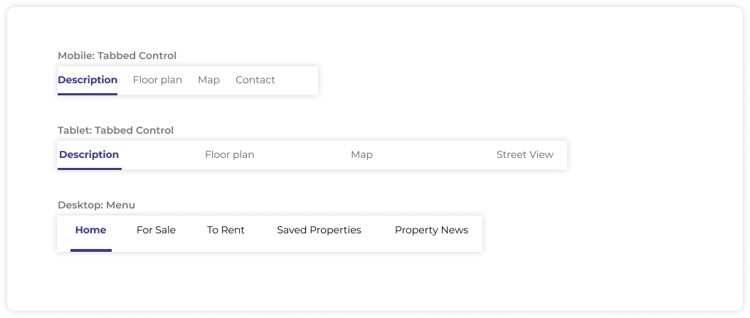
Navigation
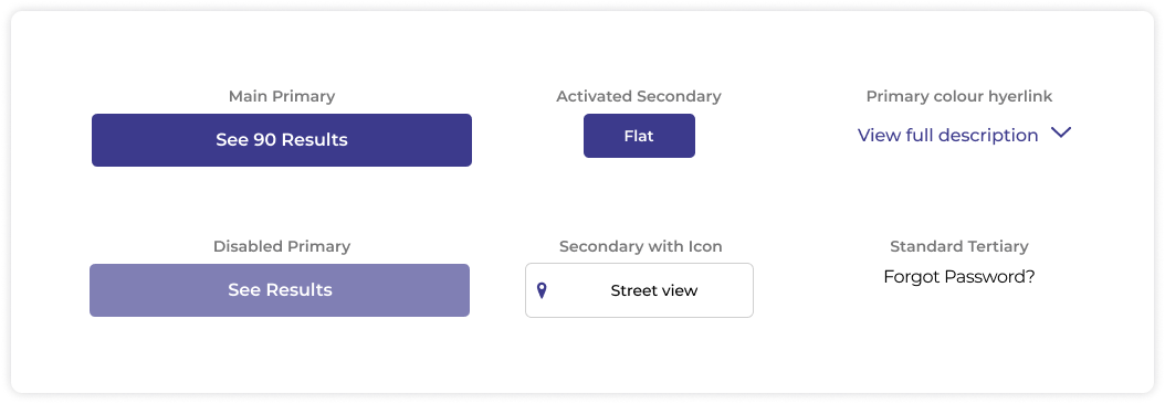
Buttons
Imagery

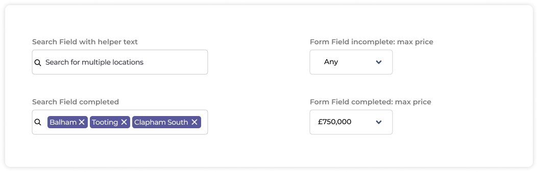
Form Fields
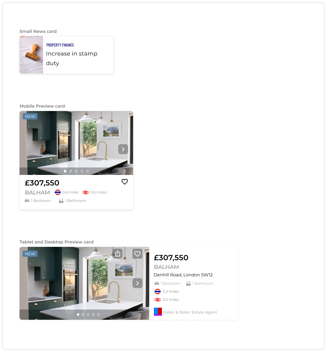
Cards
High-Fidelity Designs
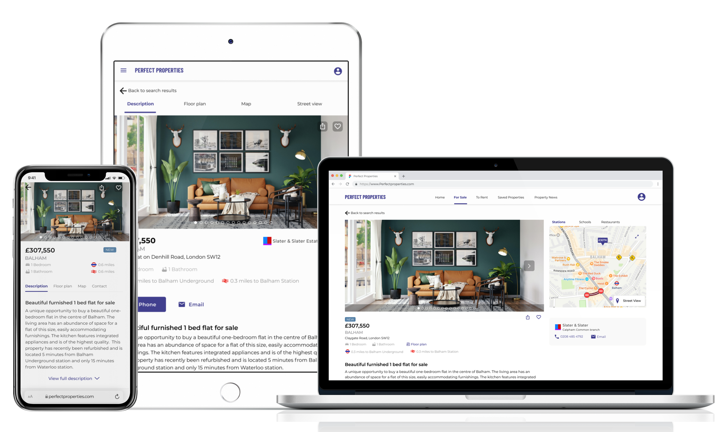
Mobile Mockups

Responsive Designs
Following the mobile-first approach, I waited until the mobile screens were ready for prototyping before adapting them for different breakpoints. For the tablet breakpoint, I incorporated an 8 column grid and for the desktop, a 12 column grid.
Reflections
Next Steps
In the future, I could conduct usability testing to continue iterating on my designs and make improvements if users flag up potential issues. Another step is to add some additional functionality as such a tool where users can compare multiple properties from their saved lists.
What could have gone better?
During the early iterations of the Home page for the tablet and desktop breakpoints, I experimented with different design layouts due to the additional space these breakpoints allowed. However, the designs for the tablet and desktop breakpoints focused on being visually appealing, lacking functionality leading to an inconstant design across all three breakpoints. I decided it was best to focus on functionality and came up with a more uniform design in line with the mobile breakpoint. This setback cost me valuable time during this project and resulted in me running to an even tighter deadline.
What did I learn?
During this project, I learned a lot about UI design and how colour and typography can change the look and feel of the app. UI is just as important as UX. At the start of this project, I made a conscious effort to name my layers and files appropriately in Figma, this saved time when making iterations of my designs. Finally, this project has taught me how important it is to have a consistent design across all breakpoints.