Quick Custom Q Project
Redesigning the landing page
Project Overview
The Problem
The Quick Custom Q website is responsive and works for mobile, tablet and desktop devices. All breakpoints have four cards containing text with moving animation behind them creating an accessibility problem. The website uses one image twice on the same page with other images placed over it. The tablet breakpoint lacks margins and in places, has poor padding between UI elements. The desktop side navigation isn't well suited to this breakpoint.
Furthermore, the client wanted the redesigned landing page to look and feel similar to the existing one containing the same basic structure, images and UI elements.
The Solution
To redesign the landing page for mobile, tablet and desktop with good UI elements and padding whilst creating a uniform design.
My Role
UX/UI Designer
Tools
Figma, Pencil and paper
My Design Process
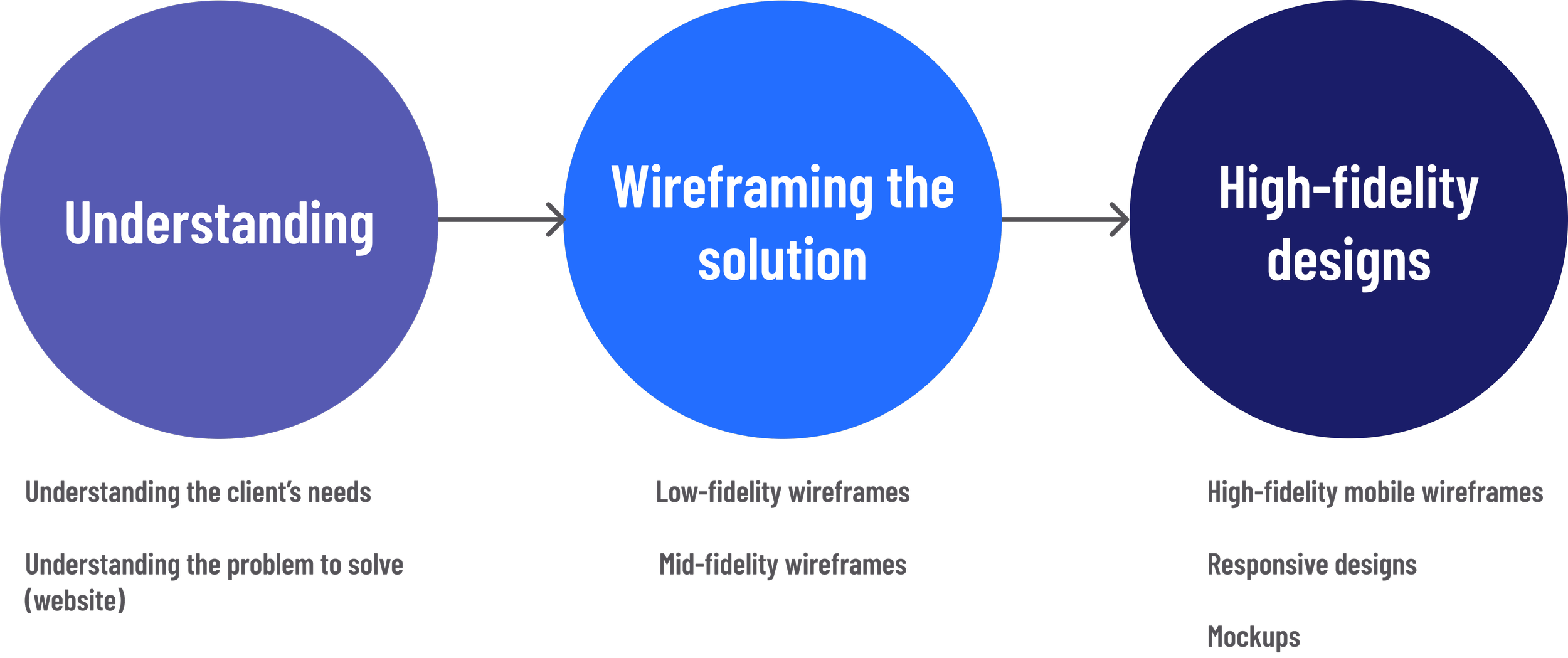
Understanding
Client
To understand what the client wanted from the redesigned website, I arranged a call to gather their requirements. From this call, I better understood the scope of the project.
Landing Page
After the call with the client, I took a deeper dive into the existing landing page to examine ways I could improve it for each breakpoint.
Landing page prior to redesign

Wireframing the Solutions
Low-Fidelity
The next stage was to create some low fidelity wireframes to structure how the app functions and meet the needs of the users.

Top section Bottom section
Mid-Fidelity
Next, I created some greyscale mid-fidelity wireframes using Figma. I added some UI elements to better convey the functionality of the app.

Top section Bottom section
High-Fidelity Designs
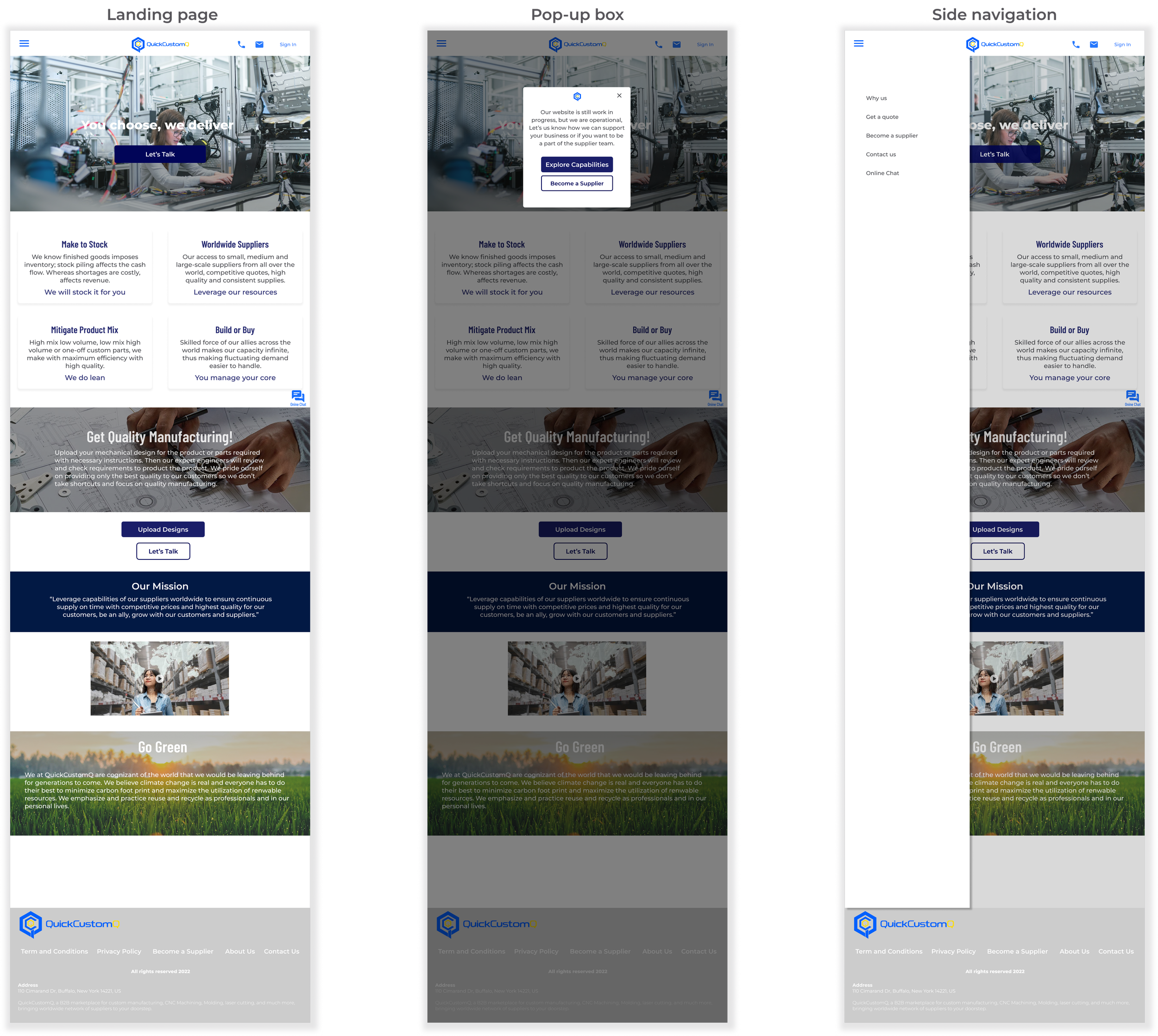
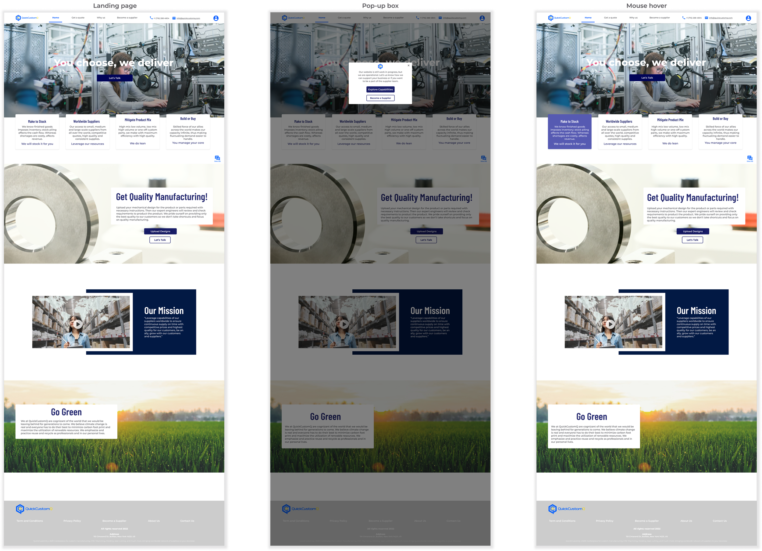
Mobile breakpoint
After some iterations, the high-fidelity wireframes I proposed to my client were ready. The client wants some changes to the designs, and below are the high-fidelity wireframes I presented to my client.

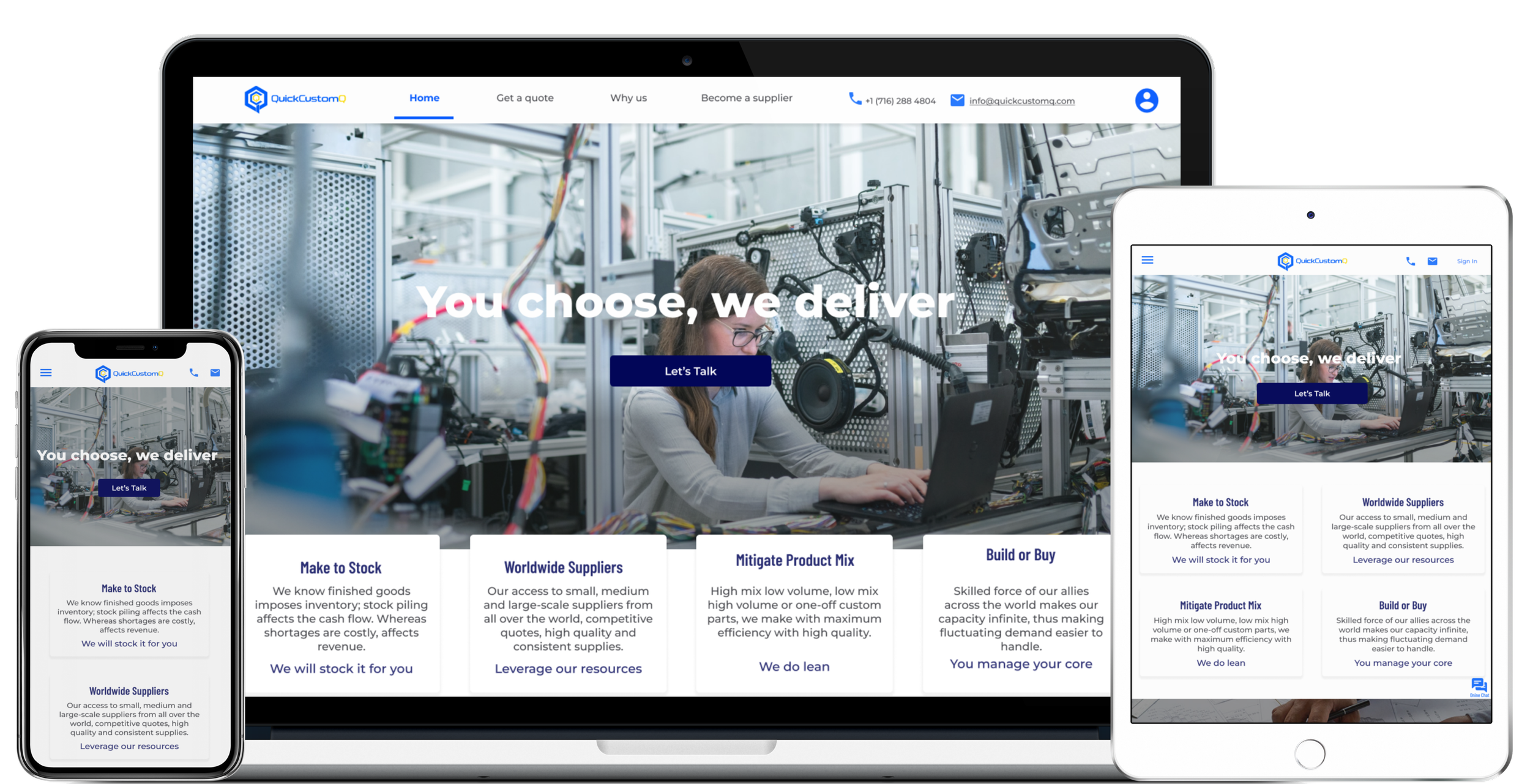
Responsive Designs
Following the mobile-first approach, I waited until the high-fidelity wireframes for the mobile breakpoint were finished before adapting them for different breakpoints. For the tablet breakpoint, I incorporated an 8 column grid and for the desktop, a 12 column grid.