Olive Project
An app designed to improve people’s mental health who suffer from or with workplace stress
Olive Project Overview
The Problem
Work can be incredibly stressful for people, working long hours to meet tight deadlines and under pressure from senior management can take its toll. Working under these conditions can harm people's mental health and is not sustainable. We explored different ways people can improve their mental health.
The Solution
To create a web application where people can track their daily moods to receive tailored recommendations on improving their mental health. Furthermore, users will be able to access reliable resources about different mental health conditions and how to cope with them.
Credit: CareerFoundry
My Role
UX Designer/Researcher
Timeframe
September 2021 - January 2022
Tools
Figma
Optimal Workshop
UsabilityHub
Lookback
Balsamiq
Invision
Understand
Problem Statement and Hypothesis
Users of the health app Olive need a way to improve and track their mental health because it's important to be mentally well whilst finding ways to deal with workplace stresses. We will know this to be true when we see the daily moods of users improve via the daily mood check-in on the app.
List of Possible Problems
Mental health is a bit of a taboo subject so people might not be willing to reach out for help when they need it.
It is easy to find conflicting information online, confusing potential users.
Proposed Solutions
Users will be able to access reliable resources on different mental health conditions. The information will include what causes it, how it affects people and ways to improve their mental health. The app will also have depression and anxiety tests. Once completed, the app will create a list of recommendations on ways to improve their mental health.
A way users can record their daily mental health (mood) such as unhappy, sad, okay, good, very happy etc. This data will be displayed to them in a visual chart so users can see how much progress they’ve made.
When a user of the app doesn’t do their daily mental health check-in or hasn’t reached their goal for daily steps, the app will send them a notification/alert to remind them to do so the next day.
Business Requirement Document
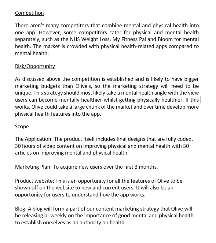
Competitive Analysis
Bloom mainly focuses on helping people improve their sleep and reduce stress levels. The app claims to have strategies for reducing anxiety, depression and anger. Bloom offers users meditation exercises such as breathing techniques to help people relax in addition to interactive cognitive-behavioural therapy (CBT) video classes.
Observe
User Interviews
As a part of the research for this project, I conducted three interviews with potential users of a mental health app. From these interviews, I was able to collect attitudinal and qualitative data to gain a better understanding of how the users think so I could see the world through their eyes.
Insights and Key Findings from Interviews
For all interviewees, their jobs seemed to be the biggest stress in their lives. A common theme arose from the interviews the words ‘senior management’ playing a role in their work-related stress.
Interviewees wanted algorithmic suggestions/ recommendations based on information inputted into the app. Additionally, some interviewees said they wanted a mood check-in feature and potentially could be combined with the algorithmic recommendations.
There was no common theme regarding how the interviewees managed their stress levels or high levels of anxiety.
Most participants felt content delivered in a video or an article is the most effective way of getting the message across.
Most interviewees are physical activity such as attending the gym or playing sports but some are more active than others.
Insights and Key Findings from Interviews
From conducting my user interviews, I collected some interesting insights so I created some empathy map to identify users behaviours, needs/goals and pain points.
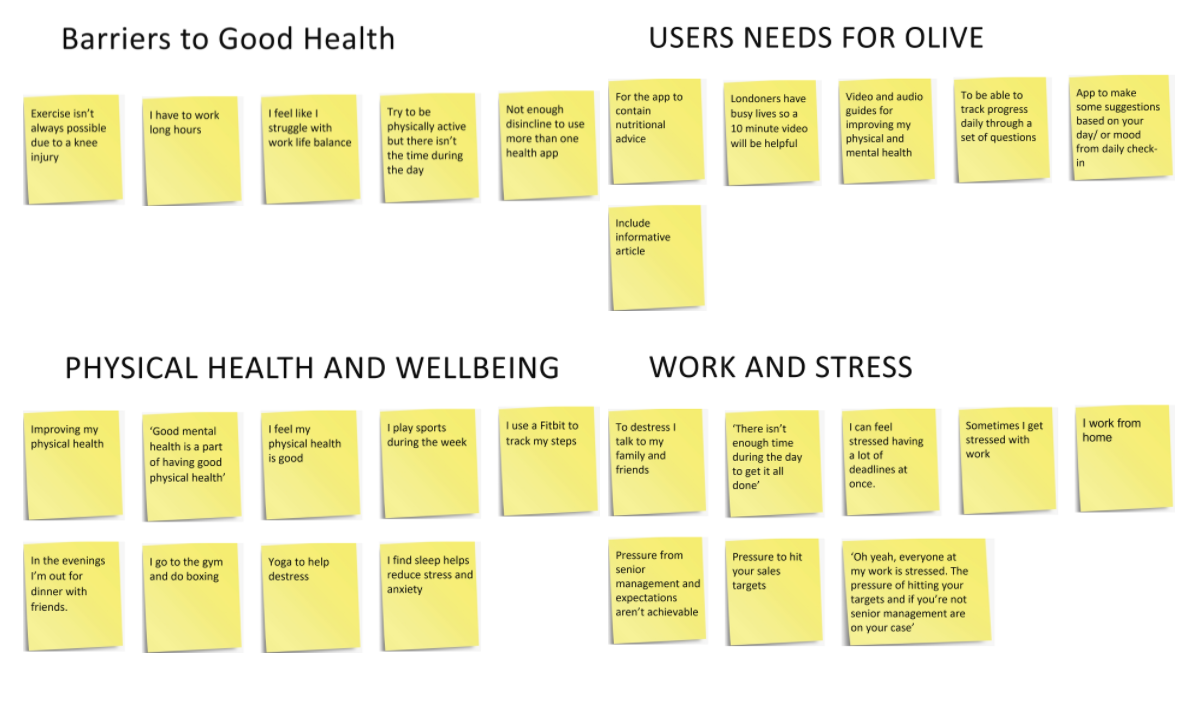
Affinity Map
After creating the persona empathy maps, I created some affinity maps to identify themes to allow me to understand the needs and pain points of the participants.
A photo of myself interviewing a participant in a coffee shop.
Point of View
User Personas
To understand my target audience and to help prioritise the functionality of my app I created two user persona from the insights I collected from the user interviews. These personas helped ensure my app adhered to user-centered design principles throughout Olive. Below is one of the personas I created.
Ideate
User Flows
I created a series of user flows because it’s a good tool for discovering what screens I will need in my app before starting the information architecture phase for my app.
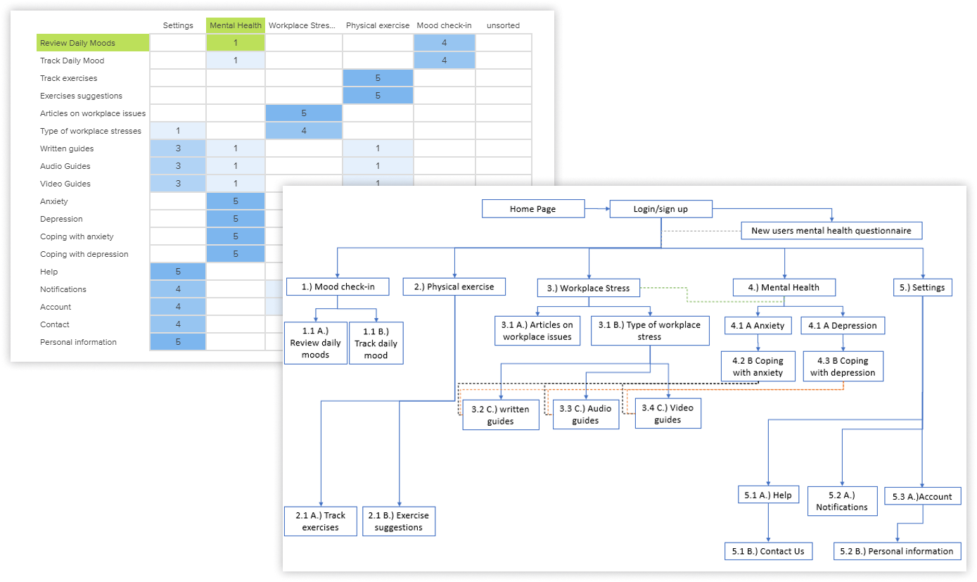
Card Sorting and Sitemap
To help refine my sitemap and to test the information architecture of my app I conducted an online closed card sorting workshop consisting of five categories and eighteen topics. Five participants completed the card sorting with 60% of participants who took part in the study were located in Germany and 40% in the UK. After analysing the results from the card sorting exercise I revised the sitemap as below.
Prototype
Low-Fidelity Wireframes
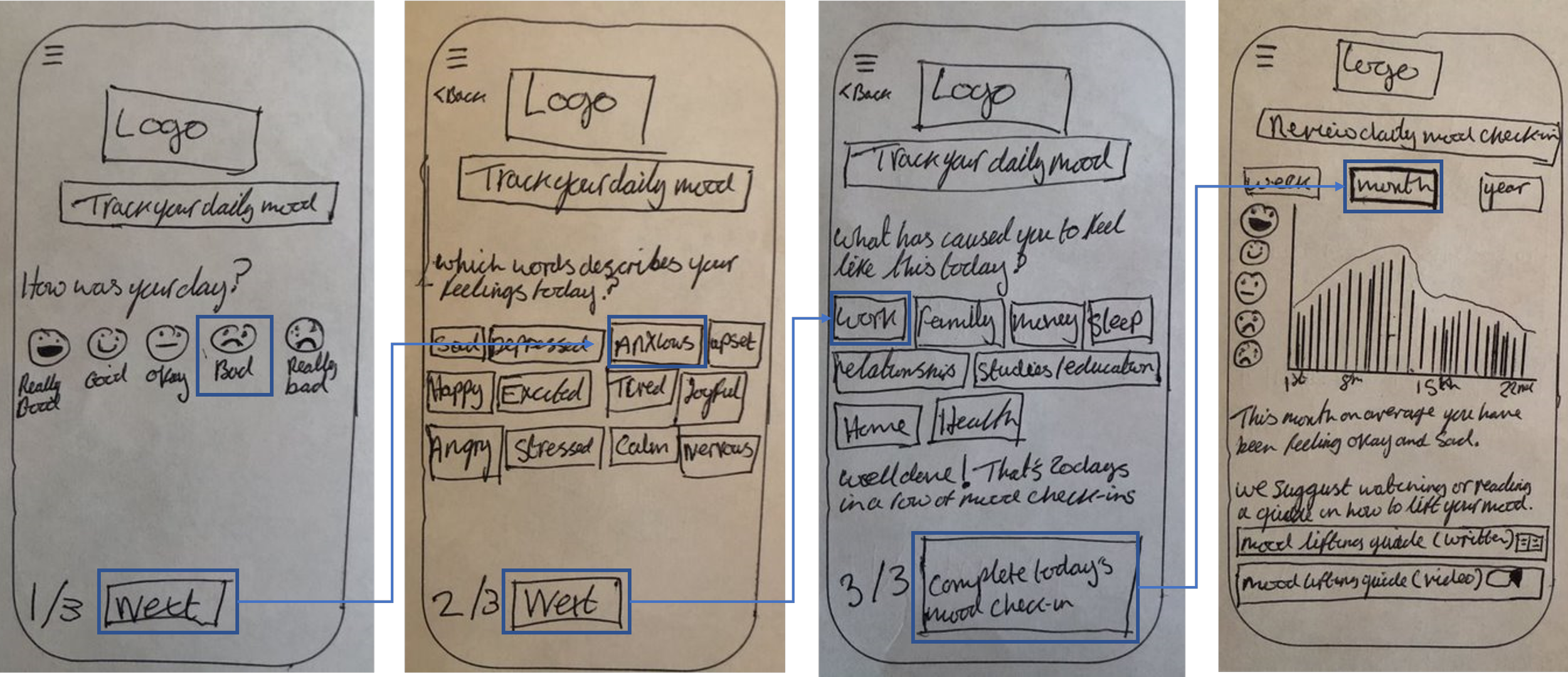
I created a series of low-fidelity wireframes to highlight the high-level functionality of the design. These were sketched on paper so I could focus on the core structure and navigation of my app rather than the finished visual design.
Flow 1: New Starter questionnaire
A user creating an account and completing the New Starter Questionnaire.
Flow 2: Track your Daily Mood
A user tracking their daily mood, the final screen displaying the user's daily mood in a chart.
Mid-Fidelity Wireframes
Using Figma, I created a series of mid-fidelity wireframes and at this point, I tried not to use colour or graphics in my design. Below are some of my mid-fidelity wireframes, I used them in a prototype to test some of the core features of the app with potential users to gain feedback and to make further iterations.
Test
Usability Testing and the Results
The mid-fidelity wireframes were used in a prototype for a usability test study so I could gather some evaluative research on my designs.
To help catalogue all the feedback from the usability testing, I created an affinity map to categorise to group information together to determine if there were any patterns or themes. After creating the affinity map, I created a rainbow spreadsheet to help me analyse the data.
Findings from Usability Testing
The usability testing revealed the prototype’s features were liked by the participants and they managed to complete the tasks. However, some required more assistance than others. The testing highlighted some required improvements to my prototype’s design and below is an example of one of the issues raised. After receiving this feedback, I made changes to my design.
Feedback: To access the resources on anxiety you have to complete the anxiety test.
The severity of error: 3, Major usability problem.
Suggested Change: On the home screen the anxiety section has been made more accessible.
Evidence: 1 participant (P1) highlighted this due to suffering from anxiety would like to access the resources without completing the test.
High-Fidelity Prototype
After creating the mid-fidelity wireframes, I transformed them into a high-fidelity prototype with colour and graphics. My high fidelity wireframes consisted of several iterations from user feedback, peer feedback (as above), accessibility guidelines and more. Click the prototype button below to see my high-fidelity prototype.
High-Fidelity Screens
Future and Reflection
Future Development of Olive
From conducting some secondary research for this project, I discovered there is a link between good mental health and good physical health. The app I’ve created is heavily tailored towards helping people with poor mental health. As a part of me developing Olive further, I would make the physical health elements more prominent within my app. For example, when users track their daily mood and continuously state they feel anxious and stressed the app would suggest doing some high-intensity exercise such as running with a personal trainer explaining more to maintain good breathing etc.
What went well?
My user interviews went well without any technical difficulties and all of them engaged well throughout the interviews. Their engagement allowed me to better understand the problem I was trying to solve. The interviewees gave me a good understanding of the biggest stresses in their lives (workplace stress).
What could have gone better and what did I learn from it?
Creating my high-fidelity wireframes and making some changes to my designs took longer than I originally anticipated, which meant the project took longer than expected. Olive was my first UX design project, so I had no prior experience in creating high-fidelity wireframes and didn't foresee how long it would take. Upon reflection, I am happy I decided to concentrate on creating high-quality, high-fidelity wireframes rather than completing the project at a faster pace. This project has taught me how important it is to schedule enough time for all stages of a project.


